نمودارهای عنبیه نشان دهنده یک ابزار تجسم داده قدرتمند است که به تحلیلگران امکان می دهد داده های چند متغیره را در قالب شعاعی نمایش دهند. برخلاف نمودارهای سنتی، یک نمودار آیریس قابلیت های منحصر به فردی را برای تجسم روابط پیچیده بین چندین متغیر به طور همزمان ارائه می دهد. خواه دانشمند داده، محقق یا علاقهمند به تجسم باشید، درک نمودارهای عنبیه میتواند توانایی شما را برای برقراری ارتباط موثر اطلاعات پیچیده افزایش دهد.
درک نمودارهای عنبیه: تعریف و ساختار

ساختار اصلی نمودار عنبیه که محورهای شعاعی و تقسیم بندی داده ها را نشان می دهد
نمودار عنبیه (گاهی اوقات نمودار شعاعی یا نمودار ناحیه قطبی نامیده میشود) یک روش تجسم دایرهای است که دادههای چند متغیره را در امتداد محورهای متعددی که از یک نقطه مرکزی گسترش مییابند نمایش میدهد. هر محور یک متغیر متفاوت را نشان میدهد، با نقاط دادهای که در امتداد این محورها رسم شده و به هم متصل شدهاند تا اشکال محصور شده را تشکیل دهند. تجسم به دست آمده شبیه عنبیه است، از این رو نام آن است.
ساختار اساسی نمودار عنبیه شامل:
- نقطه مبدا مرکزی که همه محورها از آن تابش می کنند
- محورهای شعاعی متعدد نشان دهنده متغیرهای مختلف
- نقاط داده در امتداد هر محور با توجه به مقادیر آنها رسم می شوند
- خطوط متصل یا مناطق پر شده بین نقاط داده
- کدگذاری رنگ اختیاری برای نشان دادن ابعاد اضافی
نمودارهای عنبیه در آشکار کردن الگوها، نقاط پرت و روابط در چندین بعد به طور همزمان برتری دارند. ماهیت شعاعی آنها آنها را به ویژه برای داده های چرخه ای، تجزیه و تحلیل مقایسه ای، و موقعیت هایی که در آن نمودارهای سنتی ممکن است برای نمایش روابط پیچیده به وضوح مشکل داشته باشند، موثر می کند.
برای شروع ایجاد نمودارهای عنبیه آماده هستید؟
الگوهای نمودار عنبیه رایگان ما را دانلود کنید و همین امروز شروع به تجسم داده های خود کنید.
دانلود قالب های رایگان
کاربردهای واقعی نمودارهای عنبیه
نمودارهای عنبیه به دلیل توانایی آنها در مدیریت موثر تجسم داده های چند متغیره، در زمینه های متعدد کاربرد پیدا کرده اند. در اینجا سه نمونه قانع کننده از نمودارهای عنبیه در عمل آورده شده است:
1. Data Science: Fisher’s Iris Dataset Visualization

تجسم نمودار عنبیه مجموعه داده معروف عنبیه فیشر که سه گونه را با هم مقایسه می کند
شاید مناسب ترین برنامه، مجموعه داده های عنبیه فیشر (که به طور اتفاقی نامش را به اشتراک می گذارد) اغلب با استفاده از نمودارهای عنبیه تجسم می شود. این مجموعه داده معروف شامل اندازه گیری های چهار ویژگی (طول کاسبرگ، عرض کاسبرگ، طول گلبرگ، عرض گلبرگ) برای سه گونه عنبیه است. نمودار عنبیه به زیبایی هر چهار بعد را به طور همزمان نمایش می دهد و مقایسه گونه های مختلف و شناسایی ویژگی های متمایز را از طریق الگوهای تقسیم بندی داده ها آسان می کند.
2. معیارهای عملکرد در تجزیه و تحلیل کسب و کار

نمودار عنبیه عملکرد تجاری که KPIها را در چندین بخش نشان می دهد
سازمان ها از نمودارهای عنبیه برای ردیابی شاخص های کلیدی عملکرد در چندین بخش یا واحد تجاری استفاده می کنند. هر محور معیار متفاوتی (رشد فروش، رضایت مشتری، کارایی عملیاتی و غیره) را نشان میدهد که به مدیران اجازه میدهد تا به سرعت نقاط قوت و ضعف را شناسایی کنند. تجسم شعاعی آن را به ویژه برای بررسی عملکرد سه ماهه یا سالانه موثر می کند و امکان تجزیه و تحلیل چند متغیره را در یک نگاه فراهم می کند.
3. تحقیقات بیولوژیکی و پزشکی

نمودار عنبیه که الگوهای بیان ژن را در نمونه های مختلف بافت نشان می دهد
در تحقیقات ژنومیک و پزشکی، نمودارهای عنبیه به تجسم داده های بیولوژیکی پیچیده مانند الگوهای بیان ژن در نمونه های مختلف بافت یا گروه های بیمار کمک می کند. فرمت شعاعی به محققان اجازه می دهد تا چندین ژن یا نشانگرهای زیستی را به طور همزمان رسم کنند و خوشه ها و همبستگی هایی را که ممکن است در تجسم های سنتی آشکار نباشند آشکار می کند. این نرم افزار قدرت نمودار عنبیه را در مدیریت مجموعه داده های بیولوژیکی با ابعاد بالا نشان می دهد.
این مثال ها تطبیق پذیری نمودارهای عنبیه را در دامنه های مختلف نشان می دهد. توانایی آنها در مدیریت تجزیه و تحلیل چند متغیره آنها را به ابزارهای ارزشمندی برای تصمیم گیری مبتنی بر داده در هر دو زمینه علمی و تجاری تبدیل می کند.
نمودارهای عنبیه در مقابل سایر روش های تجسم

مقایسه نمودار عنبیه، نمودار دایره ای و نمودار رادار که مجموعه داده یکسان را به تصویر می کشد
مزایای نمودار Iris
- برتر برای تجسم داده های چند متغیره (5+ متغیر)
- برای شناسایی الگوها و نقاط پرت عالی است
- برای مقایسه چندین مجموعه داده به طور همزمان موثر است
- از نظر بصری متمایز و جذاب است
- نمایش فشرده روابط پیچیده
محدودیت های نمودارهای عنبیه
- منحنی یادگیری تندتر برای تفسیر مخاطب
- برای مقایسه ارزش دقیق کمتر دقیق است
- می تواند با متغیرهای بیش از حد به هم ریخته شود
- نیاز به انتخاب رنگ و طرح دقیق دارد
- کمتر رایج است، بنابراین ممکن است نیاز به توضیح بیشتری داشته باشد
مقایسه با نمودارهای پای
در حالی که هر دو نمودار عنبیه و نمودار دایره ای از یک فرمت دایره ای استفاده می کنند، اهداف متفاوتی دارند. نمودارهای دایره ای در نشان دادن روابط متناسب در یک مجموعه داده واحد (بخش هایی از یک کل) عالی هستند، اما با چندین متغیر مبارزه می کنند. از سوی دیگر، نمودارهای عنبیه می توانند به طور موثر چندین متغیر و مجموعه داده را به طور همزمان نمایش دهند و آنها را برای تقسیم بندی داده های پیچیده و تجزیه و تحلیل مقایسه ای برتری دهند.
مقایسه با نمودارهای رادار
نمودارهای رادار (که به آنها نمودارهای عنکبوتی یا وب نیز گفته می شود) نزدیک ترین بستگان به نمودارهای عنبیه هستند. هر دو از محورهای شعاعی برای نمایش داده های چند متغیره استفاده می کنند. با این حال، نمودارهای عنبیه معمولاً از پر کردن ناحیه استفاده می کنند و می توانند به طور مؤثرتری مجموعه داده های متعدد را از طریق لایه بندی و کدگذاری رنگ نشان دهند. نمودارهای رادار اغلب بر خطوط متصل به جای نواحی محصور تأکید می کنند، که می تواند تشخیص الگو را در مجموعه داده های پیچیده چالش برانگیزتر کند.
ایجاد نمودار عنبیه با پایتون و Matplotlib
این آموزش گام به گام را دنبال کنید تا نمودار عنبیه خود را با استفاده از پایتون و کتابخانه محبوب Matplotlib ایجاد کنید. ما از مجموعه داده عنبیه فیشر به عنوان مثال برای نشان دادن این فرآیند استفاده خواهیم کرد.

کد پایتون و تجسم نمودار عنبیه حاصل
مرحله 1: محیط خود را تنظیم کنید
ابتدا مطمئن شوید که کتابخانه های لازم را نصب کرده اید. شما به NumPy، Pandas و Matplotlib نیاز دارید. اگر قبلاً آنها را ندارید، آنها را با استفاده از pip نصب کنید:
pip install numpy pandas matplotlib
مرحله 2: کتابخانه ها را وارد کنید و داده ها را بارگذاری کنید
اکنون، کتابخانه های مورد نیاز را وارد کرده و مجموعه داده iris را بارگیری کنید:
import numpy as np

import pandas as pd

import matplotlib.pyplot as plt

from sklearn.datasets import load_iris
عنبیه = load_iris()
df = pd.DataFrame(data=iris.data, columns=iris.feature_names)
df['species'] = iris.target
df[‘species’] = df[‘species’].map({0: ‘setosa’, 1: ‘versicolor’, 2: ‘virginica’})
Step 3: Prepare Data for the Iris Chart
Calculate the average values for each feature by species to create our iris chart:
# Calculate mean values for each feature by species

means = df.groupby('species').mean()
angles += angles[:1]
setosa = means.loc[‘setosa’].values.tolist()
setosa += setosa[:1]
versicolor = means.loc['versicolor'].values.tolist()
versicolor += versicolor[:1]
virginica = means.loc['virginica'].values.tolist()
virginica += virginica[:1]
برچسب ها = ویژگی ها
برچسب ها += برچسب ها[:1]
مرحله 4: نمودار عنبیه را ایجاد کنید
اکنون، بیایید تجسم نمودار عنبیه واقعی را ایجاد کنیم:
# Create the plot

fig, ax = plt.subplots(figsize=(10, 10), subplot_kw=dict(polar=True))
# هر گونه را ترسیم کنید
ax.plot(زاویه، setosa، 'o-'، linewidth=2، label='Setosa'، color='آبی')
ax.fill(زاویه، ستوزا، آلفا=0.25، رنگ='آبی')
ax.plot (زاویه، versicolor، 'o-'، linewidth=2، label='Versicolor'، color='green')
ax.fill (زاویهها، versicolor، alpha=0.25، color='green')
ax.fill(angles, virginica, alpha=0.25, color=’red’)
ax.set_xticks(angles[:-1])
ax.set_xticklabels(labels[:-1])
plt.title(‘Iris Dataset – Feature Comparison by Species’, size=15)
plt.legend(loc=’upper right’)
plt.tight_layout()
plt.show()
Step 5: Customize Your Iris Chart
You can further customize your iris chart by adjusting colors, transparency, line styles, and adding annotations. Here’s how to enhance the visualization:
# Add grid lines and adjust their appearance

ax.grid(True, linestyle='-', alpha=0.5)
ax.plot(angles[0], setosa[0], ‘o’, markersize=10, color=’blue’)
ax.annotate(‘Setosa sepal length’, xy=(angles[0], setosa[0]),
xytext=(angles[0]-0.2, setosa[0]+1),
arrowprops=dict(arrowstyle=’->’, color=’black’))
Get the Complete Python Code
Download the full Python script with additional customization options and sample datasets.
Download Python Code
Creating a Simple Iris Chart with HTML and CSS

HTML/CSS implementation of a simple iris chart
For web developers, here’s a simplified implementation of an iris chart using HTML and CSS. This approach creates a static visualization that can be embedded directly into web pages:
<!-- HTML Structure -->

<div class="iris-chart-container">

<div class="iris-chart">

<div class="axis axis-1"><span>Sepal Length</span></div>

<div class="axis axis-2"><span>Sepal Width</span></div>

<div class="axis axis-3"><span>Petal Length</span></div>

<div class="axis axis-4"><span>Petal Width</span></div>

<div class="axis axis-5"><span>Symmetry</span></div>
<div class=”data-point point-2″ style=”–value: 0.6;”></div>
<div class=”data-point point-3″ style=”–value: 0.9;”></div>
<div class=”data-point point-4″ style=”–value: 0.7;”></div>
<div class=”data-point point-5″ style=”–value: 0.5;”></div>
</div>
</div>
And the corresponding CSS:
/* CSS Styling */

.iris-chart-container {

width: 400px;

height: 400px;

margin: 0 auto;

}
.axis-2 { transform: rotate(72deg); }
.axis-3 { transform: rotate(144deg); }
.axis-4 { transform: rotate(216deg); }
.axis-5 { transform: rotate(288deg); }
position: absolute;
right: -60px;
transform: rotate(90deg);
transform-origin: left center;
font-size: 12px;
}
position: absolute;
top: 50%;
left: 50%;
width: 10px;
height: 10px;
background: #3498db;
border-radius: 50%;
transform: translate(-50%, -50%);
}
.point-2 { transform: rotate(72deg) translateX(calc(var(–value) * 180px)) rotate(-72deg); }
.point-3 { transform: rotate(144deg) translateX(calc(var(–value) * 180px)) rotate(-144deg); }
.point-4 { transform: rotate(216deg) translateX(calc(var(–value) * 180px)) rotate(-216deg); }
.point-5 { transform: rotate(288deg) translateX(calc(var(–value) * 180px)) rotate(-288deg); }
position: absolute;
top: 50%;
left: 50%;
width: 100%;
height: 100%;
clip-path: polygon(
calc(50% + 180px * 0.8 * cos(0deg)) calc(50% + 180px * 0.8 * sin(0deg)),
calc(50% + 180px * 0.6 * cos(72deg)) calc(50% + 180px * 0.6 * sin(72deg)),
calc(50% + 180px * 0.9 * cos(144deg)) calc(50% + 180px * 0.9 * sin(144deg)),
calc(50% + 180px * 0.7 * cos(216deg)) calc(50% + 180px * 0.7 * sin(216deg)),
calc(50% + 180px * 0.5 * cos(288deg)) calc(50% + 180px * 0.5 * sin(288deg))
);
background: rgba(52, 152, 219, 0.3);
transform: translate(-50%, -50%);
}
This implementation creates a basic iris chart with five axes. You can customize it by adjusting the number of axes, colors, and data values. For dynamic data, you would need to generate the CSS values using JavaScript based on your dataset.
5 Best Practices for Effective Iris Chart Design

Before and after comparison showing iris chart design improvements
1. Limit the Number of Variables
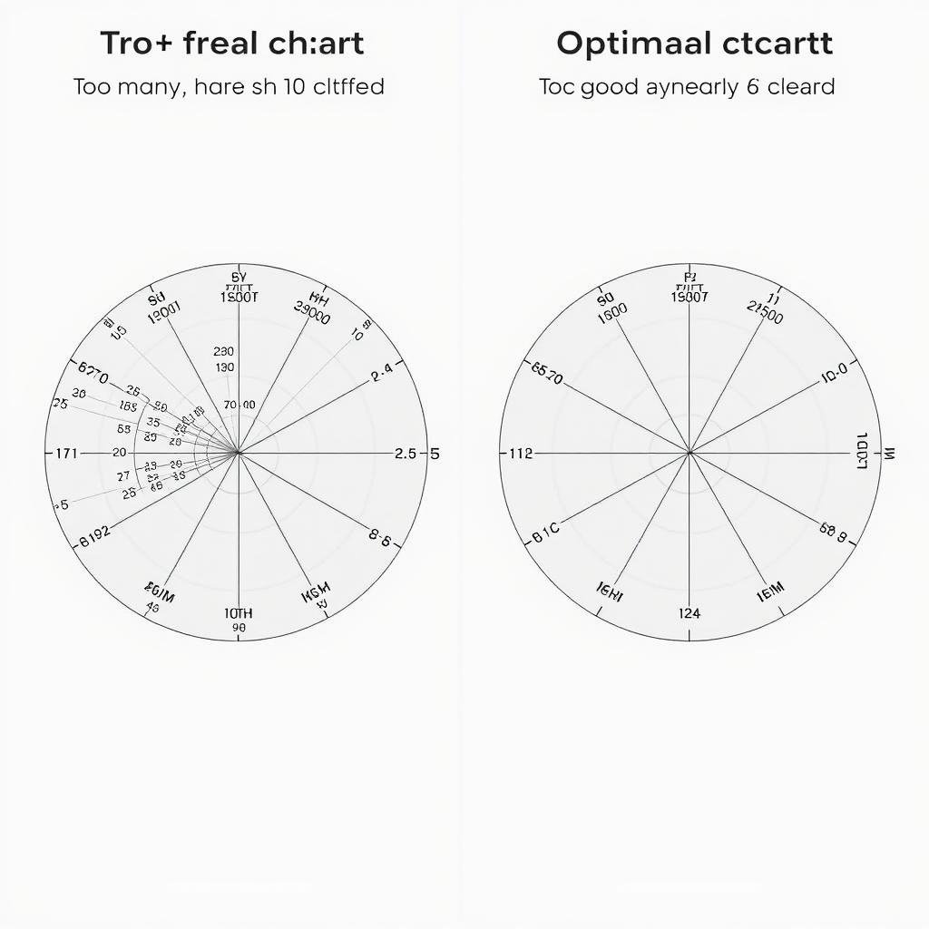
While iris charts can theoretically accommodate many variables, limiting them to 5-8 axes typically produces the most readable results. Too many variables create visual clutter and make pattern recognition difficult. If you have more variables, consider creating multiple iris charts or using alternative visualization methods for some dimensions.
2. Use Consistent Scales
Ensure all axes use consistent scaling to prevent visual distortion. If variables have different units or ranges, normalize them to a common scale (typically 0-1 or 0-100%). Inconsistent scaling can lead to misleading visualizations where some variables appear more significant than they actually are relative to others.
3. Choose Appropriate Color Schemes
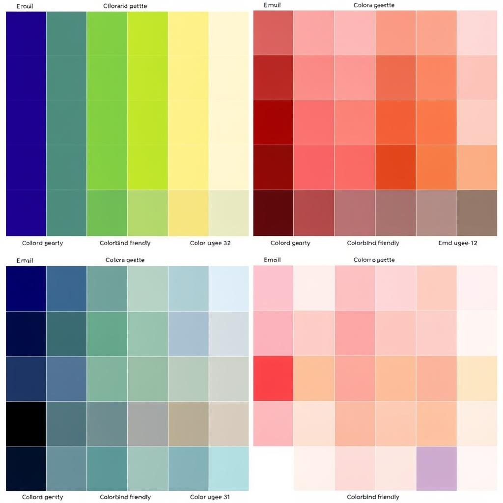
Select colors that enhance readability and convey meaning. For multiple datasets on the same iris chart, use contrasting colors that are distinguishable even when transparency is applied. For single datasets, consider using color gradients to represent additional dimensions. Always ensure your color choices are accessible to colorblind users.
4. Provide Clear Labels and Legend
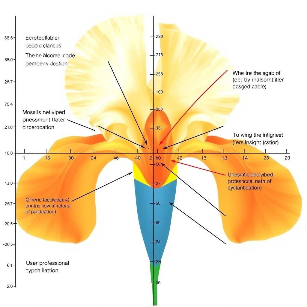
Always include clear axis labels that describe what each variable represents. Position labels to minimize overlap and ensure readability. For multiple datasets, include a comprehensive legend that explains color coding and any other visual elements. Consider adding brief annotations to highlight key insights or explain unusual patterns.
5. Include Context and Comparisons
Enhance the value of your iris chart by providing context. This might include historical averages, industry benchmarks, or target values displayed as reference lines or shapes. Comparative iris charts (showing before/after, actual vs. target, or different segments) often provide more actionable insights than standalone visualizations.

Iris chart enhanced with benchmark comparisons and reference values
By following these best practices, you’ll create iris charts that effectively communicate complex multivariate relationships while remaining accessible and insightful to your audience. Remember that the ultimate goal is clarity of communication, not just visual appeal.
Explore Our Iris Chart Gallery
See examples of expertly designed iris charts across various industries and use cases.
View Iris Chart Gallery
Conclusion: Mastering the Art of Iris Charts
Iris charts represent a powerful addition to your data visualization toolkit, especially when dealing with multivariate analysis and complex data segmentation. Their unique radial structure allows for intuitive pattern recognition and comparison across multiple dimensions simultaneously.
We’ve explored what iris charts are, examined their real-world applications across various domains, provided a step-by-step tutorial for creating them with Python, and shared best practices for effective design. Whether you’re visualizing scientific data, business metrics, or any other multivariate dataset, iris charts offer a compelling alternative to traditional visualization methods.
As with any visualization technique, the key to success lies in understanding your data, your audience, and the story you want to tell. Iris charts excel when you need to show relationships between multiple variables and identify patterns that might be hidden in other chart types. By applying the principles and techniques covered in this guide, you’ll be well-equipped to create effective and insightful iris chart visualizations.
Ready to Create Your Own Iris Charts?
Download our comprehensive iris chart toolkit with templates, code samples, and design resources.
Get the Complete Toolkit